

How I Made A Sea Turtle Design
While I love creating artwork and designs of all fish and sea life, I particularly enjoy the opportunity to create a symmetrical design drawn from the natural symmetry of the animal.
The symmetry of most types of fish can be seen when viewing the fish from above or below. However, many fish don’t have recognizable differences when viewed from these perspectives. The sea turtle is a sea animal that has a unique and beautiful symmetrical shape that I was excited to translate into my artistic style.
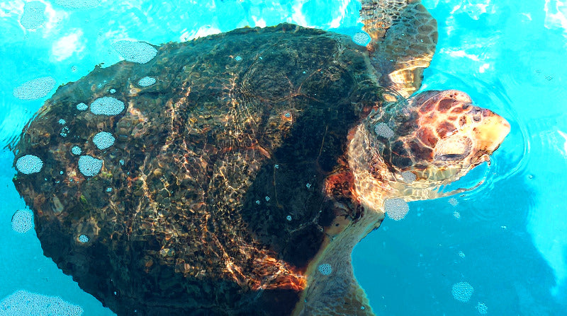
The first thing I had to do was get the right photograph of a loggerhead sea turtle. There’s no better place to do that than at Jupiter’s Loggerhead Marine Life center. An opportunity for turtles to get rehabbed back to good health and independence is also an opportunity to see these beautiful animals up close.
Here's one of the photos I took and used for this design:
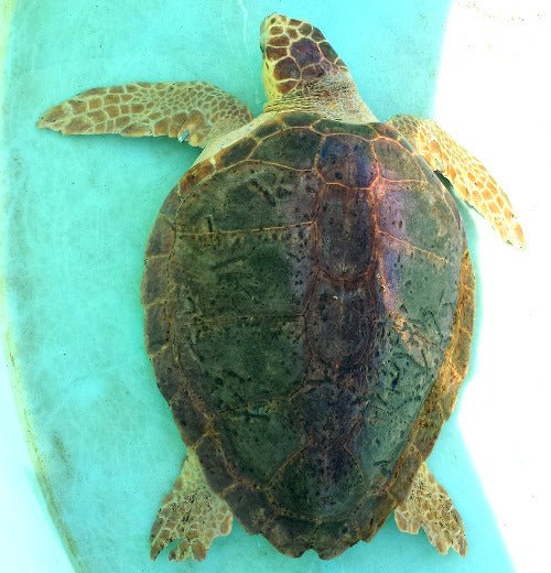
I needed to get a nice balanced shot above the turtle. I had to make sure I got good views of the flippers and the head extended from the shell. Of equal importance was capturing the precise shape of the shell and all its segments.
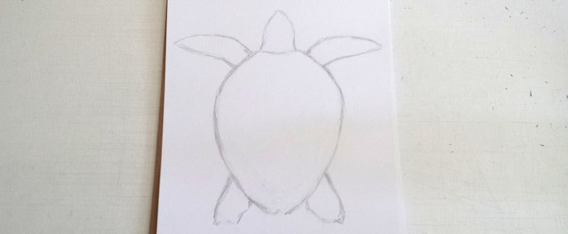
Once I was satisfied with the shot, it was time to put pencil to paper. First I blocked out the turtle’s shell to mold it to the proper proportions. Then I did the same for the head and flippers.
After that I honed in on the shell segments, making sure they were anatomically correct in count and proportion.
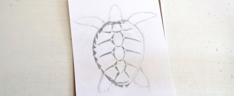
I also translated the flipper pattern and head pattern to my usual design style. Since a sea turtle's flippers don't usually have a consistent pattern, I had to try a few different types of patterns to see what would work best.
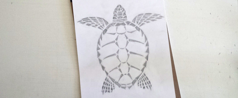
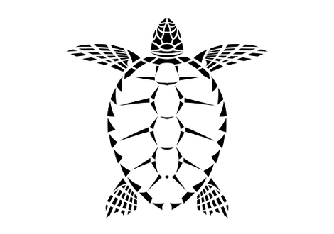
Once I was happy with the sketch, I converted it to a digital format and made further adjustments to the lines and proportions to polish the design.
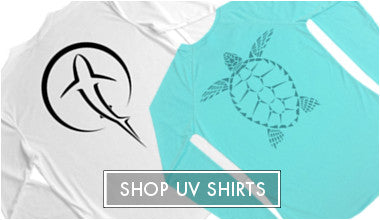
For the ladies performance shirts, I chose an ocean-like color called “Water Blue” and used a slightly darker version of the color for the design print. I also thought a tone-on-tone pink color combination would be a nice option.


For the t-shirt, I wanted to use the orangish color that underlies the beautiful colors on the shell of a Loggerhead sea turtle. I thought it would make a striking contrast to put the orange design on a dark grey t-shirt.

I would love to hear any thoughts you might have about the design and products. What do you think of the product color combinations? Please let me know by commenting below.
Comments
Kevin Zarling said:
I really love the turtle design. Along with the octopus, the turtle is my favorite of your designs. I really like images that seem to have that “tribal” aesthetic to the design. And I really like your choice of the bright orange color on dark gray. As I’ve commented before (on FB messenger), for T-Shirts men like lighter colors too, which are also a good choice for sunny climes. Light gray, stone, light blue/teal, blue/gray are some of my favorites. I REALLY like the bold colors you’ve used so far for the octopus and turtle, and I do think those might work best on darker material, but I hope you will play with some bold design colors for lighter T-shirt colors, and of course black or white is usually a good and workable choice for design colors on lighter shirts
Dawn said:
Love the designs. I think they are all great. Simple. Unique.
Holly said:
I am new to your website/facebook and was attracted by the great turtle design and the awesome gray and orange colors you selected. I absolutely love the colors you chose and simple but realistic design! Keep up the great work!
Liz said:
Your designs are somehow both dramatic and subtle. Perfect. And, oh, the turquoise!